Equipment Selector
Problem & Introduction
While leading a major redesign of the application process for renewable energy projects, one critical bottleneck quickly emerged: the Equipment Selector—the tool that enables users to add, edit, and remove equipment such as solar panels, batteries, and inverters.
Our platform’s Equipment Selector was outdated, unintuitive, and error-prone. Users frequently misreported equipment, abandoned applications midway, or required manual support from internal teams to complete the process. These inefficiencies created a ripple effect across the entire workflow.
As a regulated utility company, delays in project approvals impact our ability to meet annual connection targets. Missing those targets can result in regulatory fines ranging from $2 million to $5 million per year—in addition to damaging customer satisfaction and trust.
Role: Product Designer/Product Owner
Impact:
Accelerated customer project completion by reducing over 300 daily task durations by an average of 3 hours per project through targeted UX enhancements.
Streamlined internal workflows, cutting project processing times by 5–10 days via strategic design interventions and process optimization.
Led weekly design reviews with cross-functional teams and senior leadership, effectively translating complex design concepts and expanding project visibility across the organization.
Team: Product Manager, Engineers, Stakeholders
Duration: 4 months
Deliverables:
Stakeholder interviews
Competitive analysis
Heuristic evaluation
Current & future state journey maps
Two rounds of usability testing
Wireframes & interactive prototypes
High-fidelity designs
Workshops with Software engineers,project managers, electrical engineers
I interviewed both internal project managers and external renewable project developers to understand where breakdowns in the Equipment Selector occurred. Despite the central role this feature plays, no competitor we analyzed had fully solved these issues
- Research and Key Insights
No error-proofing or validation: Equipment inputs often did not match the electrical line diagrams, requiring manual verification from engineers and leading to project delays. External users also had to calculate the system’s total output manually, often resulting in errors that further slowed down approvals.
Lack of support for equipment changes: The current flow does not accommodate real-world scenarios like replacing or decommissioning old or broken equipment—leaving users confused and project managers scrambling to patch missing information.
Overwhelming and unsupported data fields: The equipment detail page presented complex technical fields with no help text, tooltips, or examples—making it extremely difficult for non-engineers to complete without handholding from internal teams.
Poor catalog usability: Users needed to type exact matches to find equipment. Compounding this, visually identical options (like various Tesla PowerWall configurations) appeared without enough context, leading to incorrect selections.
Repetitive data entry: Developers often reuse the same equipment across applications but had no option to save or reuse templates—resulting in unnecessary re-entry and more room for error.
Low visibility in UI: The Equipment Selector was hidden deep within the “Application Form”, lacking clear signifiers or entry points, especially for new users.
Key Pain Points:
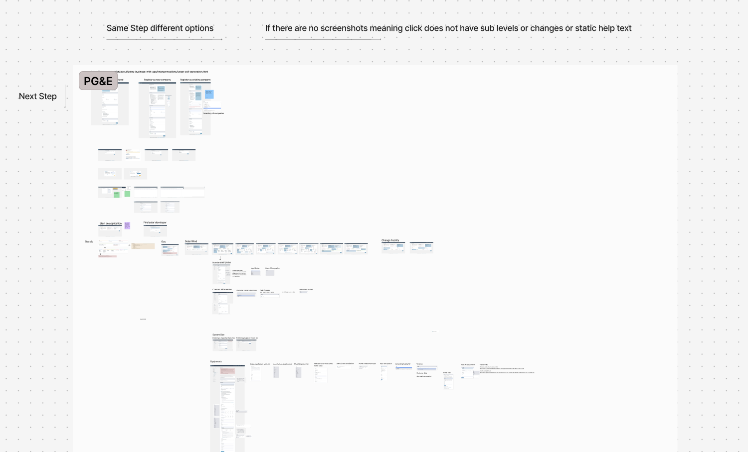
To identify best practices and pitfalls, I conducted a competitive analysis of utility providers across the Northeast and West Coast, as well as companies in adjacent spaces like Verizon.
While one competitor offered a better overall application flow, none provided an intuitive equipment selection experience. Only a single platform allowed users to save equipment templates, a feature that stood out in our survey as highly desired. We adopted and expanded on this idea in our redesign direction
Activities and Outputs
Heuristic evaluation
10 Stakeholder/User Interview qualitative analysis
Affinity Mapping
10 Stakeholder/User Interview questions/User Selections
Competitive Analysis
“I love to reuse ‘Favorite Equipment’ for future applications. But I just want to add what I need and go—without unnecessary steps.”
- Design Ideation and Testing
The quote above guided one of our central design principles: streamline the process, reduce friction, and support repeat use.
To kick off the design phase, I mapped out user flows for key tasks: Adding new or existing equipment, Decommissioning equipment, Reporting data errors, Deleting/Editing incorrect entries
Using these flows, I developed and tested multiple wireframes with 6 users (both internal and external), iterating based on their feedback.
Key Improvements
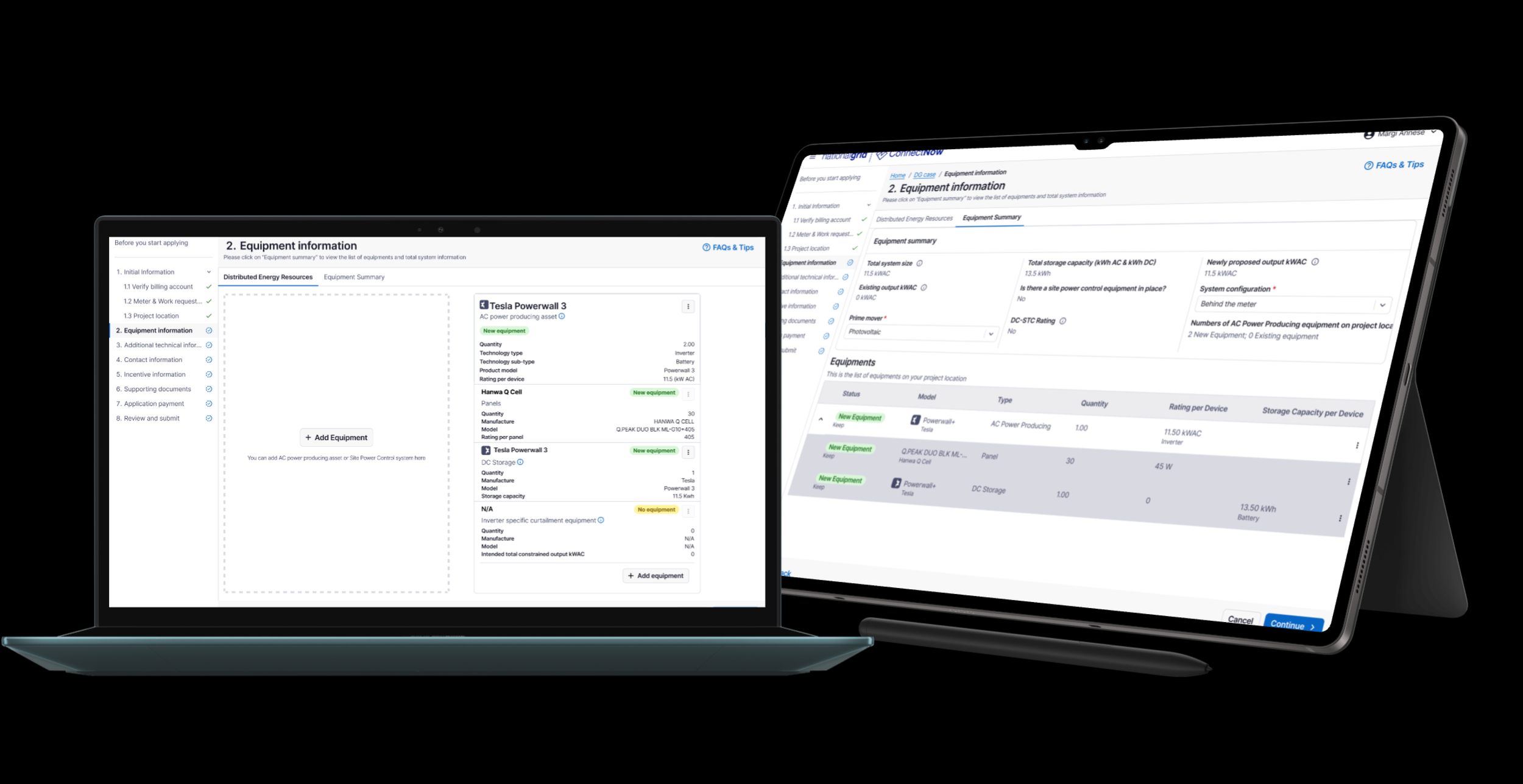
Better integration into the application flow: The Equipment Selector is now embedded within the main application process—no more digging through menus.
Favorite Equipment feature: Users can save frequently used equipment and add it to new applications with just two clicks, minimizing rework.
Improved catalog usability: A revamped catalog offers robust filtering and keyword search, displaying only the most relevant technical specs.
Line diagram alignment: The selector now mimics the structure of electrical line diagrams, ensuring consistency and reducing mismatches during engineering review.
Auto-calculation of system size: System size is calculated automatically from selected equipment, providing real-time error prevention and reducing manual math.
Table view toggle: In addition to the main UI, a table view allows users to cross-check equipment entries and catch errors quickly.
Areas for Improvement
Unnecessary steps for some users: Only 20% of projects involve existing equipment, yet the current flow requires users to review it first—slowing down the majority of users.
Critical data isn't enforced: The system does not require users to add at least one AC power-producing asset (like an inverter), which is vital for engineering review.
Potential usability issue with scrolling:The new design involves both horizontal and vertical scrolling, which could become difficult to navigate in complex equipment setups.
Missing system-level metrics: Users want to see more than just total output size—such as total AC storage and the system's primary energy source (prime mover)—to better validate system configurations.
Activities and Outputs
User Flow Mapping
Wireframes
Usability Testing
“What component I should use to develop your design?”
- Cross-Functional Collaboration
After iterating on wireframes based on usability testing, I began working closely with engineers, project managers, and electrical stakeholders, before moving into high-fidelity. By collaborating early, I ensured my high-fidelity design was both technically feasible and user-centered—minimizing rework and accelerating buy-in.
Aligning with the Design System - Engineers asked how my design would work with the National Grid Design System (NGES). I explored two layout options—Card and Section—and tested both. The Card layout won for ease of use, faster task completion, and screen efficiency, so I moved forward with it in high-fidelity
Simplifying Equipment Input - Working with electrical engineers, I reorganized the equipment detail page to make it easier for non-technical users:
Simplified field groupings
Added help text and examples
Preserved backend data structures
Planning for Lifecycle Action - Since the new design introduced equipment replacement and decommissioning, I partnered with project managers and a data architect to:
Reuse existing “Equipment Status” fields
Align internal review flows with new capabilities.
Activities and Outputs
Iterations - “Card“ Versus “Section“ component
New review process mapping

Stakeholder Workshop - Information Architecture
Usability Testing
Final Solution
Adding new equipment (with no existing equipment using favorite equipment)
Clear CTA and guided flow - Users are prompted to add an AC power-producing asset (e.g., inverter) first, ensuring alignment with engineering review requirements.
“Favorite Equipment” quick-add- Frequently used equipment can be saved and reused in just two clicks—streamlining high-volume workflows.
Card-based structure aligned with line diagrams - The equipment card layout mimics the format of electrical line diagrams, helping users visualize their system accurately and reducing mismatches.
Adding New Equipment ( Via Equipment Catalog)
Improved Equipment Catalog - Robust filters and search make it easy to locate the correct equipment
One-Click “Favorite” - Users can add any item to their Favorite Equipment with a single click for future reuse.
Equipment Summary View - A live summary shows all added equipment in one place, helping users review and verify entries before submission.
Auto-Calculated System Metrics - The system automatically calculates and displays total system size, reducing manual errors and aiding internal review.
Straightforward CTA - A clearly labeled option makes it easy for users to mark equipment for decommissioning.
Flexible reporting - Users can specify whether equipment is already decommissioned or is planned to be decommissioned.
Date selection - A date field allows users to indicate when decommissioning will occur, giving internal teams better visibility and planning support.
Decommission existing equipment
Next Steps & Learnings
Optimize Space with Micro-Interactions - Explore animation to continue optimizing space - In order to distinguish two “Add equipment“ button, a large box on the left side of the screen takes a lot of space. To optimize our design, we are going to move the button and only showing the box when users hovering over that particular “Add equipment“ button.
Introduce Data Analytics for Continuous Improvement- I’m partnering with the product manager to integrate a web analytics tool (e.g., Google Analytics or Hotjar). This will help us gather quantitative insights such as Heatmaps or Click Patterns
The Power of Small UX Wins - Features like “Favorite Equipment” seemed minor but had a huge impact on user satisfaction and efficiency. Sometimes, reducing a few repetitive clicks is more valuable than overhauling a complex process.
Early Collaboration Prevents Late Rework - By collaborating with engineers and internal stakeholders before jumping into high-fidelity design, I avoided costly design rework and ensured technical feasibility from the start.
Other Projects


